Team Members: William Huang, Cuauhtemoc (Temo) Ojeda, Ee Suk (Isaac) Ahn
Internet Access Across the States of Mexico
Note that the proportions for access to and type of internet for each state come from a representatively sampled survey conducted by INEGI, a part of the Mexican government. A description of methods can be found here. Data is shown for 2016 only.
Design Rationale
Maps serve as a natural encoding of location based data. We have data about Mexican's access to internet at a state granularity. Thus we chose to display the states of Mexico as a mercator projection with each state colored by a binned proportion of internet access. Because Mexico is near the equater and not too large a mercator projection works well. We rely on the research produced by colorbrewer to determine the change in color each of the X steps. We chose X steps because more than seven steps increases the user's difficulty in color differentiation.
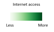
We decided to show the type of internet chart per state by using a bar chart. We decided to do so because it was the fastest way to quickly view the most common type of internet connection in each state, and allow the viewer to compare and contrast to other states data. Currently we are showing the number of surveyed people in the state that had that type of internet, once the user clicks on that particular state . Next up, is adding more data, and ways to pick which data is displayed in the map. Right now we are animating the hovering over a particular state to help the user see which state is chosen, which is followed with an animation of the state's name with the percentage of the state's population connected to a type of internet. Then, once you click a state, we make a bar graph appear with the more specified distribution of type of internet below. We will continue iterating this, and perhaps show the data inside the state in the map. Regarding legend, we added the chromatic scale between the minimum value of internet access of the states in Mexico to the maximum value. We did this to help the reader understand the different hues of color in the map. In addition, we chose green because it's represents connectivity in our view, since we believe that is a color to represent differences while not being over emphazing them, like a red would do to represent a more dramatic story.
Development Process
Within the first few minutes of meeting, we had an idea of our desired visualization. The most difficult aspects of the project -- acquiring the appropriate data and learning out to express ourselves with d3 -- took the remainder of the XX people hours that we spent since.
Because Temo and Jared had heard about a dataset detailing the distribution of Android operating systems worldwide in the Change seminar, we initially hoped to display this data in a queryable format in conjunction with the states of Mexico. Eventually Jared was able to find such data but upon contacting the companies involved, the data turned out to be propriatary. Faced with this, we changed scope slightly having found a national survey conducted by the Mexican government regarding technology usage. This is what we wanted.
We had planned to connect access to technology with demographic information about residents of Mexico, but doing so would have required too much work for the prototype. Similarly we currently only display access to internet, but will expand in the future. We still plan to include demographic infromation in our final product with the intention of allowing our audience to explore trends among different subsets of the population. For example, our final visualization should allow for a state in Mexico to easily determine if a mobile application payment application would be viable given the access to internet.
With the data in hand and a plan for visualizing it (as detailed in our issue tracker), we hoped to finish quickly. We didn't. We had not allotted sufficient time for the learning curve of d3. Following online guides, Temo produced an initial map with a geojson file of Mexico. Isaac and Will spearheaded the next effort following an example for coloropleth maps and connecting our data to the map. We then added interactive drill down on each state and shelved the remainder of our efforts for the final product.